 |
 |
 |
|
"He disappeared!" "Then let's stop looking for him." Ha ha good stuff man!
| Posted by |
|
on: 09/22/12, 18:05 |
|
|
 |
|
 |
|
Needs more karaoke...
| Posted by |
|
on: 09/22/12, 18:29 |
|
|
|
|
|
|
Whoa, surprise cameo!
| Posted by |
|
on: 09/22/12, 20:03 |
|
|
|
|
|
|
Haha, awesome! I'm looking forward to seeing how this series goes 
| Posted by |
|
on: 09/22/12, 20:41 |
|
|
|
|
|
|
Haha, me like. A suggestion: Do you have Photoshop or any image enhancing software? I love the hand-drawn look, but the contrast bugs me. It looks washed out and I think if you increased the contrast, it would make the comic more attractive imo.
| Posted by |
|
on: 09/22/12, 21:02 |
|
|
|
|
|
|
@Marsh Do you have any tips? Shirley and I struggle a bit with the contrast of our stuff sometimes but any time I try to darken it, it seems to lose some of the details. I think it just darkens everything equally when what I really want to do is widen the range of contrast I suppose? Although she has also been finding ways to get it darker from the start with various papers / inks.
| Posted by |
|
on: 09/22/12, 21:06 |
|
|
|
|
|
|
@ZeroIt takes some fiddling around with, getting a good scan in the beginning is a great start. Do you use grayscale when scanning? I believe that provides more contrast. As far as software, I have Photoshop and use Levels sparingly. There are a ton of other options (Adjustments) to use, but you have to have a delicate hand.
| Posted by |
|
on: 09/22/12, 21:15 |
|
|
|
|
|
|
@ZeroIf you've got something that's just ink, just go into Image > Adjustments > Brightness/Contrast, and turn the Contrast up. Fiddle with the levers to experiment. Afterwards, you can go into Image > Adjustments > Replace Color, then click on the color you want to adjust (white or black), and slide the lightness lever all the way to one end to get a higher contrast. Here's what happened with a minute or two of fiddling with the Collector Carl comic: 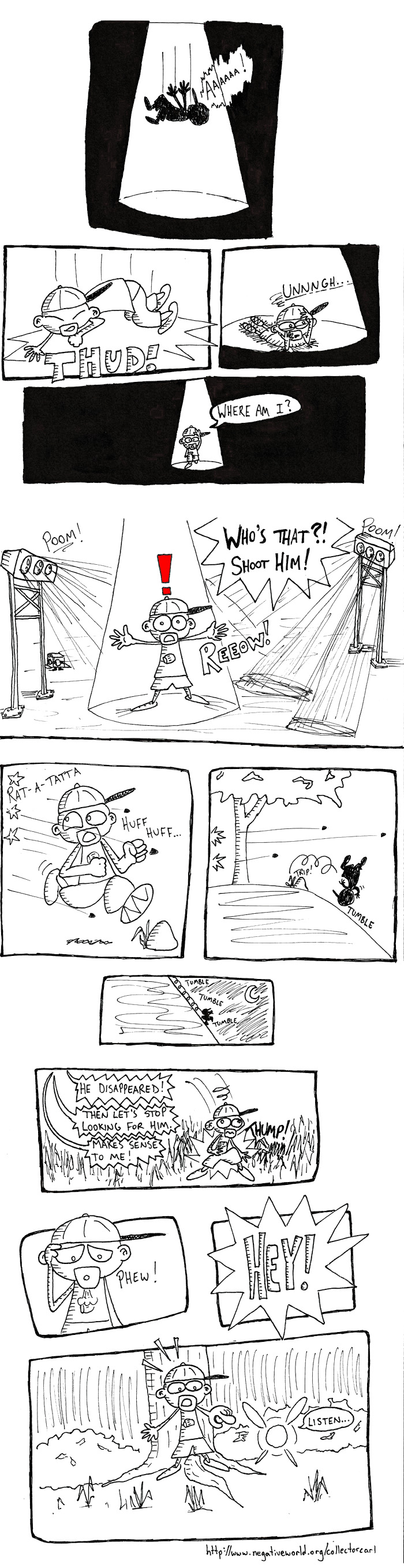
| Posted by |
|
on: 09/22/12, 21:22 |
|
|
|
|
|
|
@Marsh@TriforceBunI tried forever to do that! When I scan it in I up the brightness in order to kill scan imperfections. Thanks for showing me exactly how to do it, guys! I'm going to correct these when I get home. That looks LOADS better, TBun. You are the mansey pants. 
| Posted by |
|
on: 09/22/12, 21:27 |
Edited: |
|
09/22/12, 21:28 |
|
|
|
|
|
|
@TriforceBun Gorgeous. Good luck Paul!
| Posted by |
|
on: 09/22/12, 21:56 |
|
|
|
|
|
|
Needs more kara-- Hey! I have nothing to say that hasn't been said already.  I dig it. @PaulT-Bun IS the Mansey Pants!
| Posted by |
|
on: 09/22/12, 22:25 |
|
|
|
|
|
|
@TriforceBun But see... I honestly feel like that lost a bit of... something? in the transition.
| Posted by |
|
on: 09/22/12, 22:57 |
|
|
|
|
|
|
As the only other person in the world who enjoyed the game, did I detect an ET 2600 nod in the beginning?
| Posted by |
|
on: 09/24/12, 03:23 |
|
|
|
|
|
|
@AnandIt wasn't purposely, but funnily enough as I drew that I thought of having Carl stretch his neck out and descend slowly. Of course, I only thought it because actually doing it would have been... Odd. Also, it would make no sense within the context of the plot. Rest assured, I am always thinking about ET. 
| Posted by |
|
on: 09/24/12, 04:24 |
|
|
|
|
|
|
Nice. I like the white space in between panel borders. And the pacing + action kind of makes this feel like it's animated!
| Posted by |
|
on: 10/16/12, 19:52 |
|
|
 |
|
 |


